Approaching a digital typographic experience
Logika is a logistics service provider with the main objective of covering the entire supply chain. The large volume of information is what characterizes the content of its website. To this end, in our study, we opted to highlight information as the leading means of communication by creating a website with a strong typographic character.
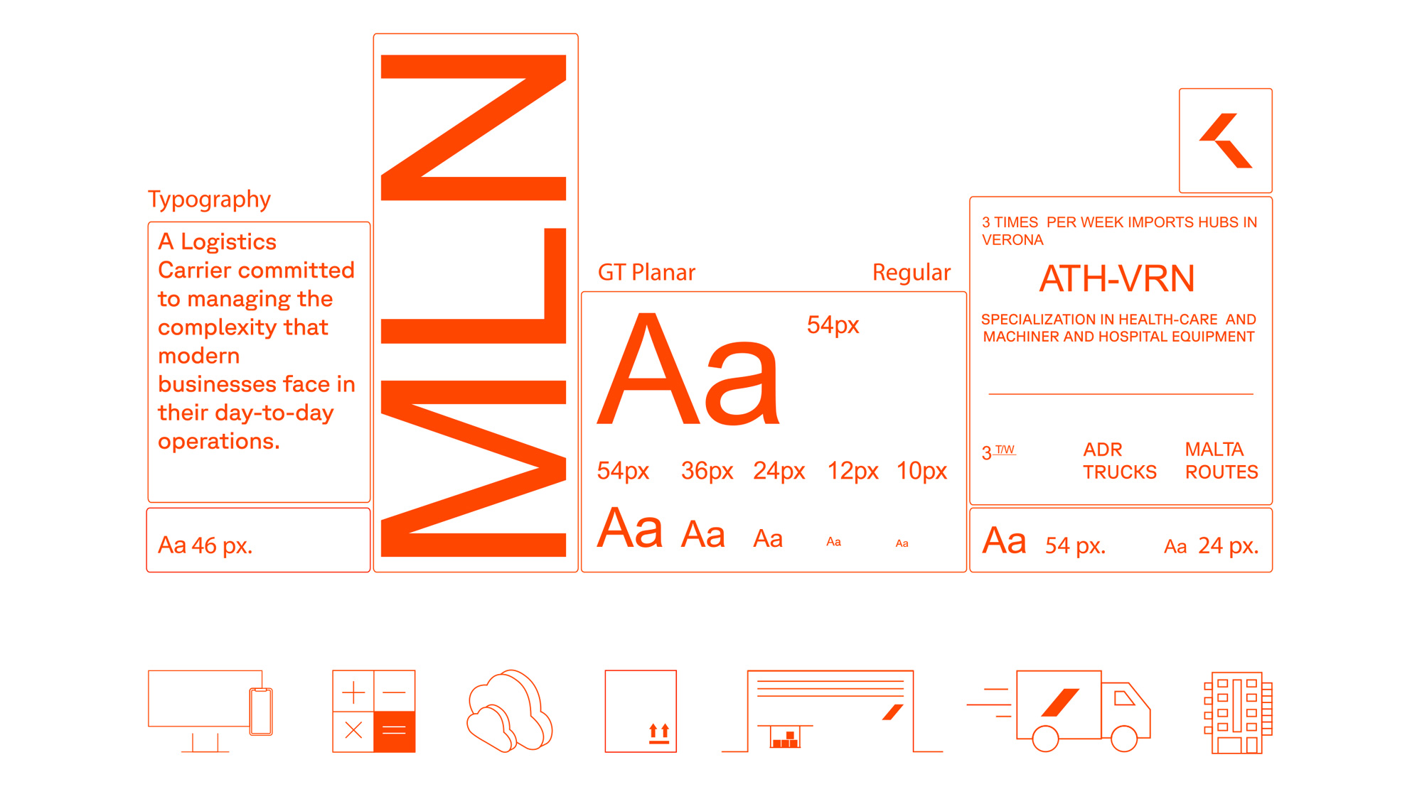
Regarding typography, we selected a modernist Swiss type family which allows great readability, regardless of size variations or length of characters and lines, making it an ideal choice for use in digital media.
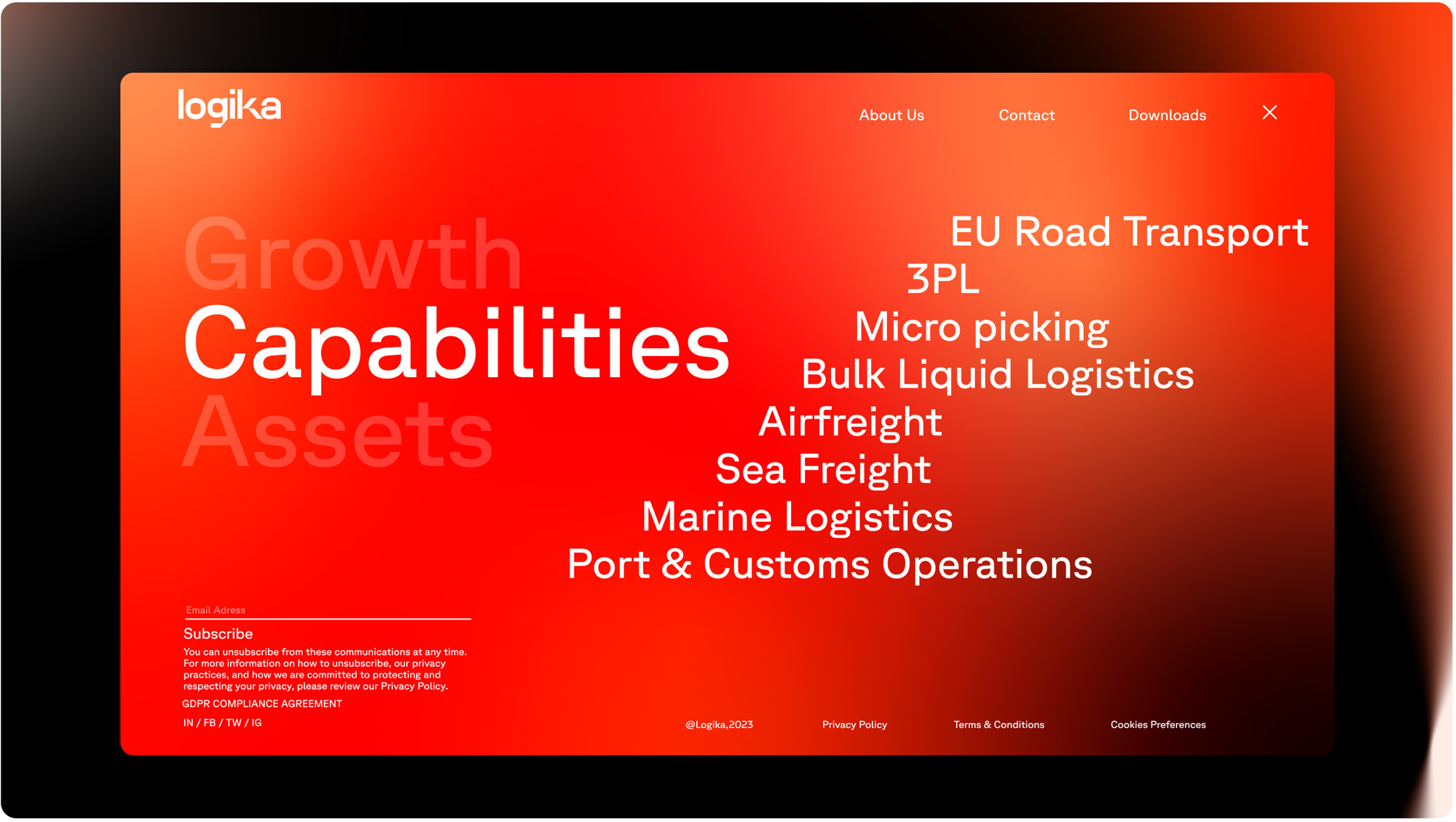
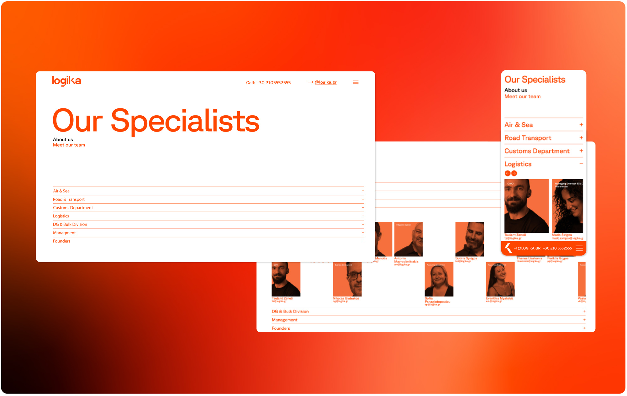
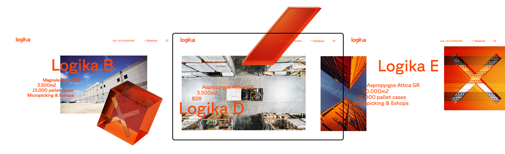
Website’s main pillars are easily and quickly accessed from the home page, allowing visitors of different interests to quickly get the information they are looking for (from vehicle drivers and the address of each warehouse to potential customers and business development).
The color palette stays two-colored, dominated by Logika’s corporate orange color. The industry essential, road map, which provides the service coverage area is also characterized by a strong typographic spirit in an original design approach.